Alabama ONE Brand/Identity
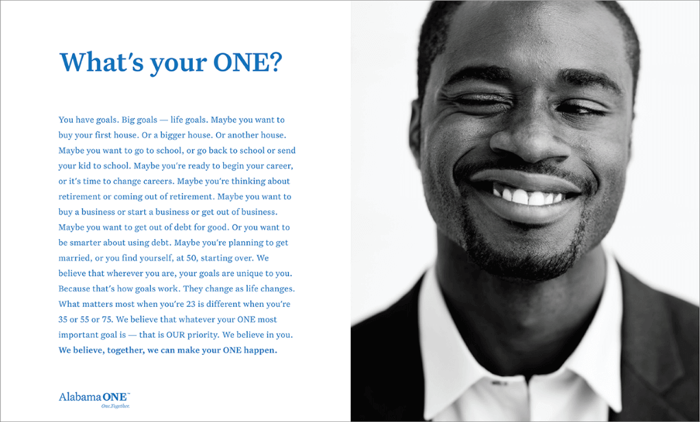
What is your ONE?
Case StudyAlabama ONE Brand/Identity
A minimalist approach creates a real point of visual differentiation from most brands in the sector.
The Challenge
Alabama ONE had experienced a number of rough years, culminating in the takeover by Federal regulators. A new leadership team, however, was leading the credit union back. They turned to FitzMartin to help rebrand the institution, reposition it around a more focused mission and increase their visibility in the market.
Industry
Financial Services
Conversion Point
Unaware to Contemplating
The Solution
Because Alabama ONE lacked any kind of guiding brand strategy, its message in all media was mixed at best. There was no cohesive message, no consistent visual direction. Our first task was to create a message, a position, that connected emotionally with their members, giving them a reason to re-evaluate the credit union. It was never about products.
People rarely feel that their bank “is looking out for the customer’s best interests.” That general sense of skepticism became the focal point for Alabama ONE. We leaned into that sense of doubt but consistently tried to demonstrate that the credit union put the members’ interests first, in everything they do. As the initial positioning copy said:
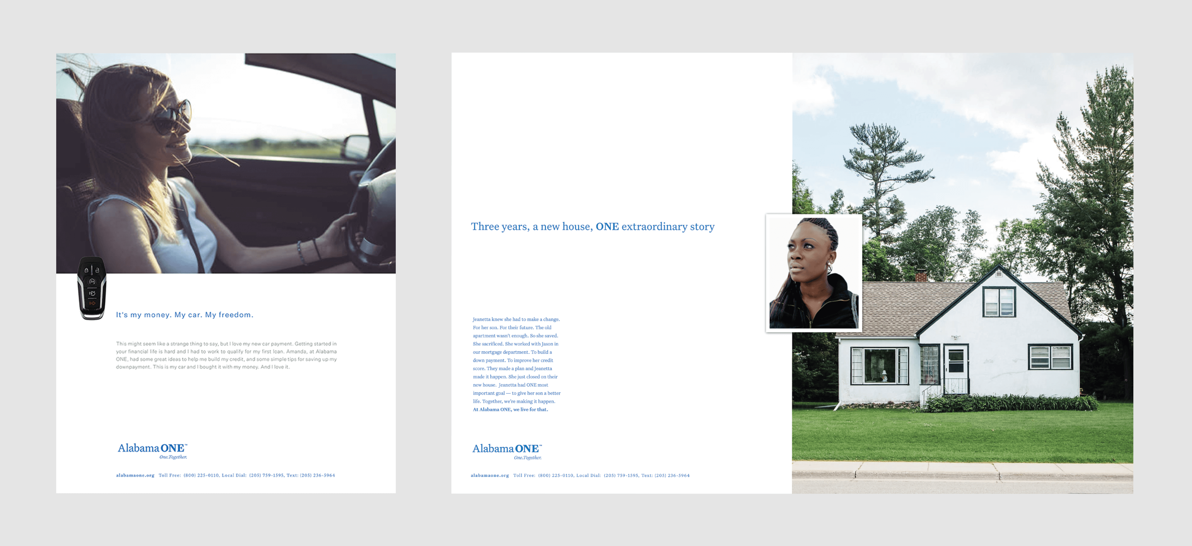
Your ONE is our priority
One. Together.You have goals. Big goals — life goals.
Maybe your most important goal is to buy your first house. Or maybe a bigger house to fit your growing family.
Maybe you want to go to school, or go back to school or send your kid to school.
Maybe you dream about getting out of debt, once and for all. Or you just want to be smarter about using debt.
Maybe you’re planning to get married, or you find yourself, at 50, starting over.That’s how it works: your goals change as life changes. What matters most when you’re 23 is different when you’re 35 or 55.
But one thing is true: most of the big goals require money; they require a healthy financial life.
At Alabama ONE, that’s our purpose. Whatever the goal that is most important to you — your ONE — that’s OUR priority. We exist to help you manage money smarter so that you can make your ONE a reality.

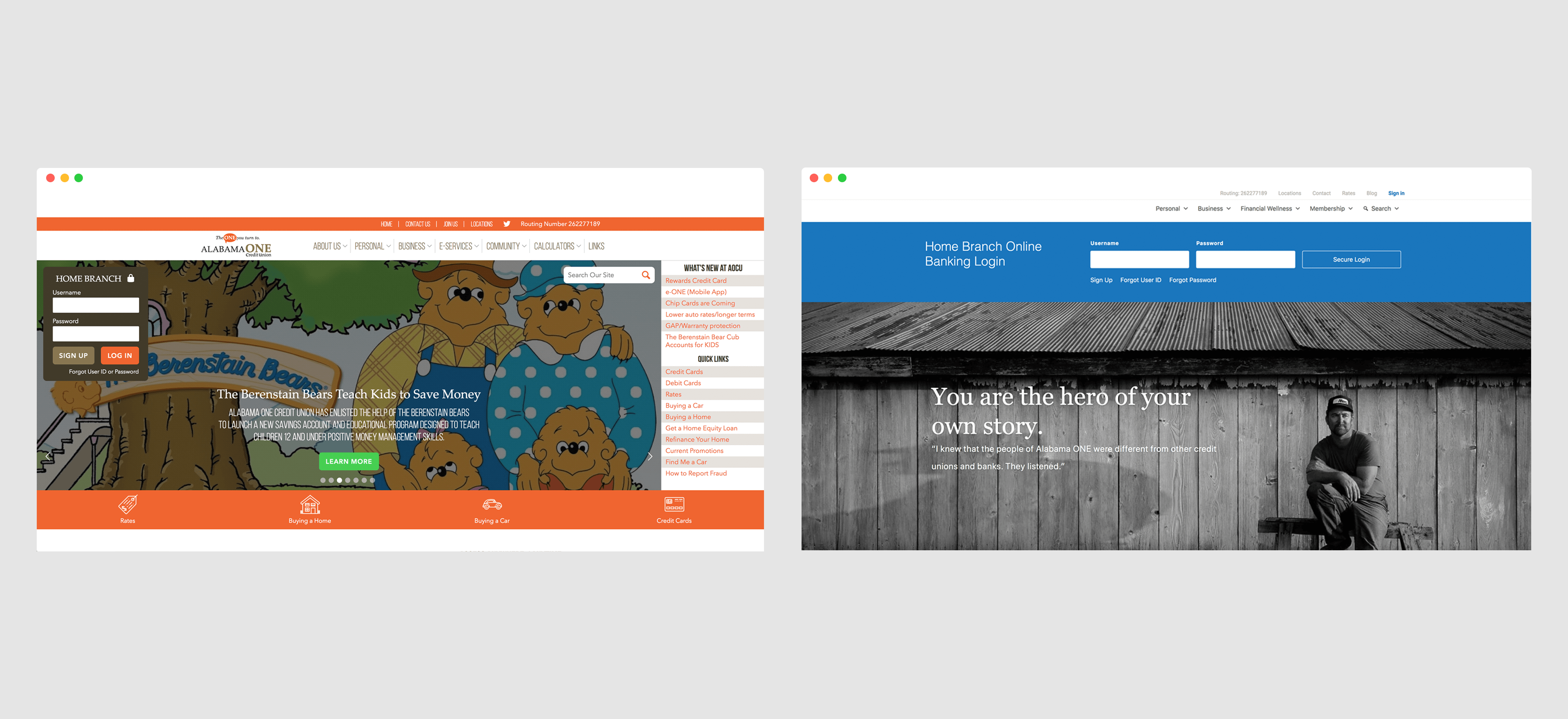
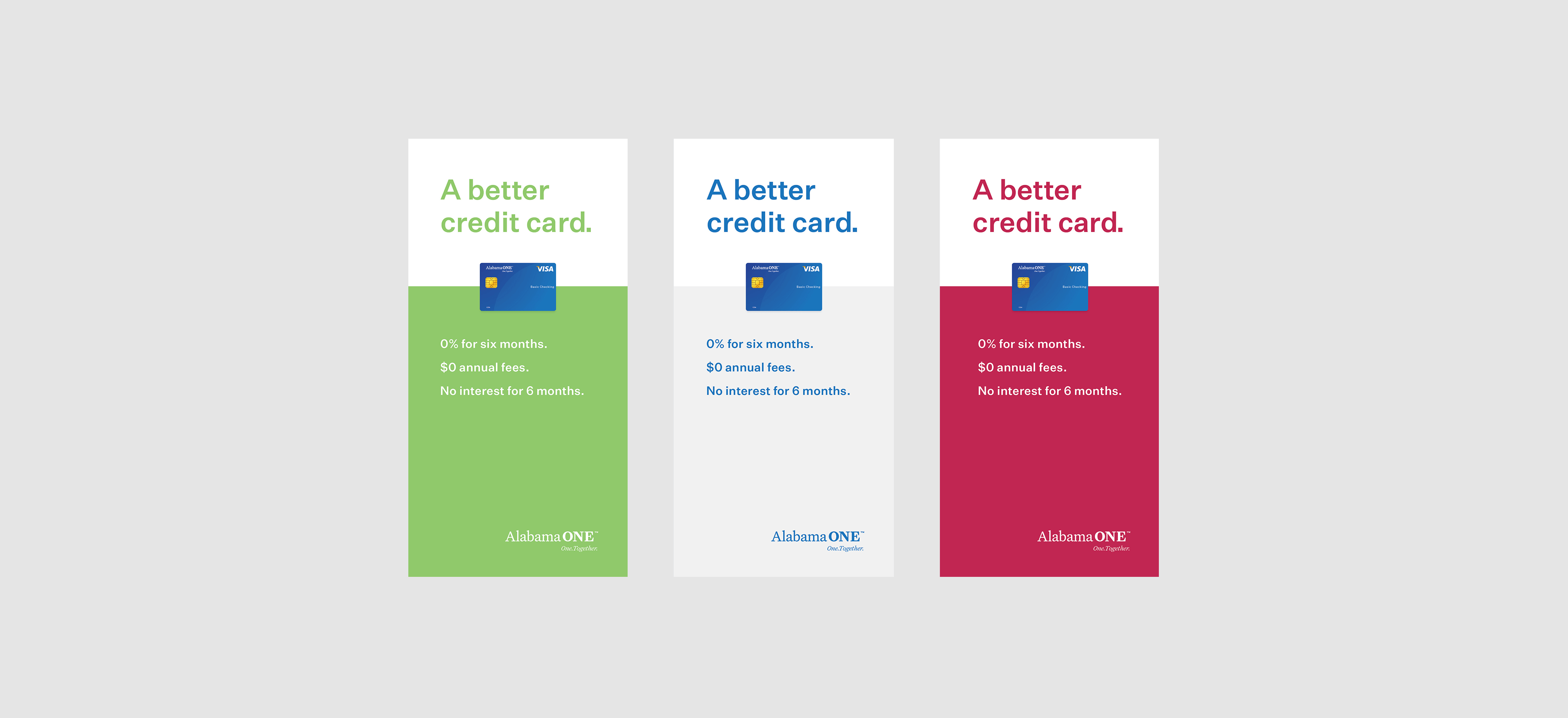
After we’d settled on a position, we worked to clean up their visual identity. Before, the credit union used so many colors in their marketing materials, it was difficult to determine the true nature of their brand. We worked to simplify, to reduce the elements in the design so that each element took on added importance. The more minimalist approach creates a real point of visual differentiation from most brands in the sector.